June 30, 2011

Search Results on Google Now Highlight Content Authors

Author Pictures Are Now In Google Search Results

There's a small chance you might have bumped into my omnipresent avatar in some new places lately - including search results, assuming you use Google. The company on Tuesday, which turned out to be an extremely busy day for them, introduced a nice feature that lets content authors claim ownership of their work and display their photo next to the appropriate search results when they match a query. This brings more personality to Google's content results, and if you are aware of the author's other work, may be yet another draw to why you would select one link over another.

My Picture Alongside Zillow Price History Results

The initiative is an extension of the authorship markup code released by the company a few weeks ago. It works by the author selecting a page on their Web site as their "About Me" page, like I have here, listing it on their Google Profile, and designating it through the appropriate HTML code in their site template.

My Picture Alongside Searches for the CR-48 Experience

Results with authors' mugs such as mine went live on Google.com today, meaning that when you search on topics like Youtify or Zillow home prices or anything else I've covered in the past, my photo from my Google Profile is next to the link. The same goes for the dozens of other blog authors who were part of the initial launch program, and more are coming. The team promises simple guides on how you too can be listed shortly, but for now, watch for photos in your results, and promise the quality of my photo won't make you click less. See also Frederic Lardinois of SiliconFilter's take.

June 29, 2011

Google IO Chromebooks To Reach Attendees In August


In May, to cheers, Google's Sundar Pichai announced that all attendees of the company's developer conference would be the recipients of free Samsung Series 5 Chromebooks, one of the two launch OEM partners, alongside Acer. Unlike other giveaways at the event, and unlike Oprah's traditional "look under the chair" showmanship, the devices were not immediately available, but would be coming soon. General availability was highlighted as June 15th. Now, as many of us have started to see via email notifications from Amazon, the promised Chromebooks won't be making it to eager recipients until early to mid August.

Last week, I got a note from Amazon with two codes - one for the free notebook and one for free shipping. But availability of product was in question as it is displayed as sold out on the merchant's site. Last night, I finally got a note with a delivery date of "August 03 2011 - August 10 2011". Checking with other attendees, they too heard either that date or even a bit later.

For those who don't already have a CR-48 lying around, as I do, and need to get their hands on a Chromebook ahead of August, BestBuy.com and Amazon might have some for purchase. Either way, once they arrive, it's an interesting reset on what you've come to expect from a laptop. I've rapidly grown accustomed to always on Internet and battery life that goes all day with my Chromebook. My fellow Google IO attendees will need to wait another month to see the same.

Aggregation Is Invisible In Google+. Thank Goodness.


The true value of a social network is the product of the people participating and the content being shared. There's no doubt some sort of mathematical program smarter geeks can compile to show just how that works, but it's true. You will participate on one service or another because of what is said and who is saying it. If the content doesn't match your interests, or the people aren't those you care about, there's little pull for you to be there. One corollary to this which evolved over the last three-plus years is that social networks gain power through being the originator of the content. While I once was a major proponent of aggregation products that pulled from many corners of the Web, the value downstream is vastly diluted, and adds to noise. This was a major problem for late adopters of FriendFeed, was immediately a problem for Google Buzz on day one, and is an ongoing problem for Facebook users, who often struggle to find ways to delete specific services' access to their feed and wall.

Google+, at least on day one, has absolutely no way to push content into the site from a third party network. This means you don't see a stream of people's Twitter updates, you don't see their blog posts automatically added, you don't see their Foursquare checkins, their Instagram photos, TurnTable spins or any of the other various update virii that flood most streams. Instead, the site is an open whiteboard for status updates, link sharing and photos, all requiring manual input. The inference, and correct assumption, is that those updates on Google+, were written by the person with specific intent for a specific audience. You don't get that feeling that they posted elsewhere and aren't participating locally - a common complaint on other services, like FriendFeed and Buzz.

At the end of 2009, my two-year fascination with aggregation-centric parlays coming to a close, I said aggregation was better in theory, arguing cross-posting should be reduced. This didn't stop Google Buzz from launching with aggregation at its core a few months later. Unfortunately, the ease at which you could pull in content from third party networks like Twitter meant many people, including Google employees, added these feeds and didn't return. It made for a subpar experience, and initial requests for updates included the ability to mute these services as a whole or from specific users.

I would bet that in time as the Google+ API is completed and released, we could soon see the opportunity for mobile and desktop clients (like Seesmic for example) to write to Google+ as a new service. I am betting Seesmic's Ping.fm is already thinking of how they can make Google+ yet another supported service. But I would push for caution in this. I've seen how the deluge of activity from sites like Twitter (and Facebook if they opened up) can drown the downstream aggregator and help it lose its identity.

Some first users of Google+ today commented about the similarities of it to FriendFeed, with nested comments, lists and real time at the core. But honestly, it's the opposite. FriendFeed launched as a major aggregator, supporting dozens of sites. Google+ starts with just one. It's refreshing.

June 28, 2011

Google+ Breaks Out of the Social Box, Ready to Score Users

More than a year after the launch of Google Buzz, rumors have been tossed about on most tech news sites about just what Google has been up to in the world of social to ebb the flow of activity that has migrated to Facebook and to a lesser extent, Twitter, over the last few years. With users spending significant time participating in social activity on the Web, it's made Google sometimes seem like the last era's winner, with it being thought the future of discovery is through friends. So long as another company owned the social graph, Google has been pushed to an unfamiliar role, as challenger. With today's launch of Google Plus (nee Google+), you can see they haven't taken the role of backup lightly - delivering a fun and engaging place that brings many of the benefits of existing social sites, but learns from their mistakes. In time, the package of Google+ could be a serious alternative for people's attention.

As a longtime Google ecosystem power user with Google Reader and Buzz, both of which I continue to use even as they've fallen in others' eyes, gaining access to Google+ today was practically second nature. Within minutes, I had started to reassemble a brand new social graph into explicit "Circles", their equivalent of lists, and could share status updates, links, and photos. The vast majority of content in Google+ feeds into a centralized stream of all friends' updates, with additional product features including built-in chat, powered by Google Talk, "Sparks", much like saved searches to surface interesting articles, "Hangouts" for instant video chats with other users, and at least on mobile, "Huddle" for group chat and instant photo uploading.

Circles, Hangouts and Sparks - All Part of Google+.

Clearly, this is no small undertaking - one Google has thought through in the year since Buzz's launch and initial privacy hiccups, and one where they have given an unprecedented (for them) amount of effort in making sure the user experience was top notch. While we've grown accustomed to helping Google test out their first iterations of beta software, Google+ is well designed out of the box, and has seen positive kudos from all corners of the Web, so far as I can tell. There are bugs, of course, but nothing dramatic.

Separating Friends By Circles In Google+

Most of us power users on various social networks, from Facebook and Twitter to lesser successes, like FriendFeed, have been reticent to adopt lists for sharing out of our corpus of friends. FriendFeed and Twitter's lists have primarily been read-only, letting you organize what you consume, and Facebook's selective filters for sharing are underutilized and challenging. The Circles in Google+ are easy, backed by starting from scratch on the social graph for the most part, and being easy enough to drag and drop to new circles, complete with old-school rotary phone like animation. I managed to set up connections with more than 400 different people on Google+ today without getting carpal tunnel syndrome. I can choose to share each post of mine with the world, or a subset of folks in each Circle.

Google + In Action With a Share from Ben Parr

The integration with Picasa and especially automatic uploading has increased the visibility and vitality of the photo service, which has similarly played second fiddle to sites like Flickr for the masses and hip apps like Instagram and Path for the geeks. Albums on Picasa are available for featuring in Google+, and photo sharing is quite simple. You can also tag any Google+ user on any photo, one of the major reasons Facebook Photos became so wildly popular - along with notifications that you'd been tagged.

Many Different Types of Notifications, All Clear In Google+

Speaking of notifications, they're nothing if not thorough. Thankfully, unlike other networks, you get follow notifications in bulk. After a certain amount of time (not exactly clear), you can get emails saying how many new people are now following your account. On the fun of day one, I got a handful with dozens apiece, rather than hundreds of separate emails. In the site itself, you can see a small number in a square highlighting the number of notifications that beg for your attention, including new connections, comments on your posts, whether someone has tagged you in Google+, or if comments have happened on a thread where you've commented. Of course, if you don't want an email or phone push notification each time that happens, you can just disable those in your settings, and reduce the amount of bacn in your life.

Congrats! You're Followed On Google+ By Lots of People!

The biggest and most exciting piece of newness with Google+ over Buzz for me, though the services are vastly different, is that Google broke out of the Gmail box on this one. While I understood the desire to automatically create one's friend graph in Gmail and embed it in a popular app, the mere act of having to head to Gmail every time I used Buzz was a real detractor for me. Google+ is its own dedicated URL and it looks great in every browser and mobile device I've tried before, even the Galaxy Tab 10 on Honeycomb.

Sparks Bring News on Topics You Choose to Google+

Right now the service is invite only, and I don't have any invites to spare - trust me, I'd pass them around like candy, because I think this is a service you just might want to enjoy. Google has invited some skepticism for false starts in the past, but from what I've seen today, especially the excitement and wholescale adoption of the launch from prominent Googlers, this time they are absolutely serious and we'll be seeing some noise from this team. Their URL is plus.google.com and you can find me here: https://profiles.google.com/louisgray/posts.

June 27, 2011

Not All Roads to the Public Markets Are Smooth Ones

In Silicon Valley, we fall in love with and memorialize success stories. Leaders of successful companies can be seen as pop culture heroes, and their decisions during times of challenge or opportunity can be told and retold as legend. The first years of companies like Apple, Microsoft, Sun, and Oracle in one era, Netscape and Yahoo! in another, Google and LinkedIn in a third, and in today's evolving present history, including Facebook, Foursquare, Groupon and more, are possibly going to be reviewed and dissected in the same way we look back on innovations from the turn of the 20th century with the assembly line, and the Industrial Revolution in centuries past.

The opportunity to grow fast, get big and get rich drives many people to flock here and try their own hand at catapulting an idea into a passion that could see millions or tens of millions of users. But, if nine of ten startups fail, for every big name I just mentioned, there are carcasses of many others that never make it. And for every rocketship IPO that has people clamoring for updates, there are others that take a longer path. (See all of the S-1 filings on the SEC)

Friday saw the second filing of an S-1 by BlueArc, my employer from early 2001 to Spring of 2009. The company is looking to raise $100 million by entering the public markets on the heels of rising revenue and reduced losses. I know the story well as I helped author the first version of this same document when we filed to go public in 2007 and was there when we withdrew the filing in 2008.

(You can safely assume I own shares, though not a significant number, and it's in my best interest if they do eventually go public. Given the company's sensitive position, I'm reticent to mention particulars, so this article is painted with a broad brush, and is as neutral as possible. Rather than ignore the news, I'm offering the filing as an example of a company that has not seen overnight success.)

The company was founded in the late 1990s, and raised more than $200 million, the most recent round completed last fall. In my time there, we signed some amazing customers, got some powerful OEM and reseller deals, and sold to new territories. We learned where our products were a great fit, and where we had challenges. We hired lots of great people, and saw others struggle. CEOs were changed a few times. We had layoffs a few times. The company and its customers made the front page of trade magazines and the business sections of the New York Times and Wall Street Journal. Other times, rumors flew about the company's viability. At one point, the noise got so bad, a leading industry analyst wrote an entire column about how he'd heard so many rumors on the company, fed by tough competitors, that he recommended anybody hearing such rumors to just ignore them.

The result of a company that has a few years under its belt, with many funding rounds, some happy investors and some unhappy, some happy employees, and some unhappy former employees, is a body of work that tells a story. For financial junkies and tech watchers, or just the curious, poring over the details of BlueArc's S-1 is interesting. There are no funny numbers like those from Groupon, who quite visibly took money off the table for its founders and key employees. There is no meteoric financial windfall like those seen at Google and assumed at Facebook. Just a growing, challenging, business in a tough market that has seen competitors purchased by industry heavyweights for billions of dollars and others, failing, just go out of business or sold for scrap.

While most of the tech press is enamored with consumer Internet plays and mobile apps, the enterprise market has its own unfair share of intrigue - often harder to grok, but just as aggressive. The South Bay especially, the world of Milpitas and San Jose, is dotted with networking firms, semiconductor firms, storage and switching companies in the shadows of NetApp and Cisco. Having lived that world for most of the last decade, coming from the position of a challenger with unique technology, I'm hoping that the colleagues of mine still at the company find a positive exit for the decade-plus some have put into the effort, or lesser tenures for the more recent arrivals. But for those of us who seem to have attention deficit disorder when it comes to watching companies start and flourish, or to our own job-hopping resumes, this is an interesting case study of one company that didn't take the easy route.

Disclosures: I was employed in the Marketing department at BlueArc from 2001 to 2009 and own a small amount of the company's common stock.

June 25, 2011

Zillow Rewrites Home Price History, Invalidates Old Data

Many people look to Zillow for third party estimates of property values, whether homes are on the market or not. One can turn to Zillow to gain property information on homes, including home features, property tax data, and previous sales. The more data-hungry or curious may even watch their own homes or target properties to see fluctuations, due to a number of factors, and get a good idea of whether homes' prices are rising or declining.

Two weeks ago, the company recalibrated its systems, and has pretty much thrown all previous years' data out the window, replacing it with new histories. So if you were using the site to get a good picture of your neighborhood, they're hoping you'll ignore what you already know and start fresh.

Coming up on the one year mark in our home which we purchased last summer, I've kept an eye on the surrounding market, both on Zillow and Redfin, to not only watch our own home's data, but seeing new sales come and go. In an economy which is by no means perfect, the weekly data coming from Zillow from its frequent "Zestimates", and tagged on my weekly Mint.com emails was pretty bad all Spring. My email archive shows eight separate consecutive downward revisions of our own home value, shaving off sixty thousand dollars in equity. While I have no intention of moving again any time soon, it was hardly reassuring.

Zillow Told Us Our Home Price Was Crashing, Then Changed Its Data

Zillow's New Data Is Smoother, Doesn't Show Crash

I even complained about the continued drops and negative feedback I saw through Zillow on one of my less-trafficked Twitter accounts, citing the $67k drop of almost 10 percent in just under three months.

Clearly the Reported Price Drops Were Weighing On Me

But on June 13th, Zillow wiped the slate clean and the year's data doesn't show such a steep decline after all, showing a comparatively straight line with a near-static value and a minimum of variance. Instead of a sharp downfall I had assumed was true this Spring, the gap between highest Zestimate and lowest is only about $20k, less than a third of the bloodbath I was seeing.

Pricing one's home for sale or financing is a delicate one, a dance of recent area sales, market trends, and all manner of comparables. But Zillow's move has me questioning not just our own home's value, and the year's graph, but all estimates I bump into, and of course, their own projections for values in years' past.

In an FAQ on Zillow's site related to "Zestimate Improvements", they mention that you "Possibly" could see changes in history, thanks to algorithm edits going back to 2006, arguing for improved "current accuracy" and "historical accuracy" - adding "We are now working on re-doing all the history."

An Excerpt from Zillow's FAQ

It's likely they know what they are doing, and with more data, they were losing confidence in both their current and historical values. But it sure didn't seem like the company was unsure about its competence before the move, and I'm not sure they're confident about their current data any more.

June 23, 2011

YouTube, Android Offer Alternative to iTunes Film Rentals

One of the new product announcements at Google IO in May was the introduction of movie rentals from the Android Market. Following the path beaten by Apple with its iTunes and Apple TV pairing, popular movie rentals can be picked up for the typical price of $2.99 or $3.99 each, are watchable in the next month and playable for 24 hours after you start. It's familiar, but new for Google, who added the option to their marketplace a month ago, making one less reason one has to be shackled to iTunes. The video rental service is powered by YouTube, who has clearly shown they know how to push Web video content to hundreds of millions of homes worldwide, and is ready to try longer-length content.

As mentioned frequently here, I've been a longtime iTunes user, and have slowly migrated away from the platform, thanks to increased use of Spotify and Google Music on one side, NOOK on the other, and now, movies, by way of Android Market, on top of Netflix Instant. The focus is not so much an anti-Apple vendetta, but just finding new ways to consume rich media on my changing array of devices. The more Android and Chrome I have in my house, the less iTunes is an option - until Apple changes its mind.

Some Top Titles On Android Market (Powered by YouTube)

The promise of the Android Market offering is to play these movies right in your Web browser, on any of your Google account-enabled devices. There's no need to download the movie (as iTunes does), but you instead start streaming after an extremely minimal amount of buffering, at either 320p or 480p. Purchases are sent to the account you have registered with Google Checkout, and the item shows in your Android Market purchase history. All straight forward.

Streaming "Just Go With It" On Chrome Via Android Market

In the last two days, I pulled down Adam Sandler's romantic comedy "Just Go With It" and Vince Vaughn's "The Dilemma". Both $3.99, I can play these videos on the Web (and even Google TV's Chrome App) and expand to full screen. In our on demand world, the experience is on par with Apple TV or Netflix Instant, and your service preference depends on the device you're using or the title you want. Using the Android Market interface is actually just a front end for YouTube's full-length feature movie rentals (see all of them here), including films like The Hangover, Harry Potter and The Deathly Hallows, The King's Speech, Knocked Up and many others. It's yet another example of Google trying to push to the browser what traditionally has been handled with desktop client software.

YouTube Reminds Me to Watch The Movie I Rented

My Rented Films Visible on YouTube

I tested the video rentals on my Mac, in both Chrome and Safari and on the CR-48, as well as on Google TV. Essentially, if the app can play YouTube videos and you can sign in with you're Google credentials, you're good to go.

My Receipt Delivered Via Email, Like Any Other Google Checkout Purchase

At Google I/O, it was promised that ChromeOS (and these rentals specifically) would bring more offline access for those outside of broadband streaming. I assume those will come soon, to solve for the poor souls stuck on airplanes who still want access, and might still be going to Apple to shell out three or four bucks at a time.

June 22, 2011

Social.com Goes for $2.6M to Secret Ukrainian Buyer

Last month, Social.com announced the lucrative domain name was going up for sale after Scott Carter, owner of the URL for more than 15 years, could no longer justify trying to throw business models at it that would stick. Following a false-start auction process two weeks ago, the domain received multiple bids by competing parties vying for the URL, including a bid for exactly $2.5 million on June 6th. The eventual purchase price of $2.6 million was reached on Monday, and just hours ago, Carter received payment. The buyer so far is uncertain, described only as a "Fortune 500 company in the Ukraine", which still leaves us guessing.

Reports of the sale reached DN Journal, a domain name industry site yesterday, saying the purchaser was a company based in the UK (United Kingdom), but Carter said multiple e-mail messages during the process referred to the buyer "as being in the Ukraine", even though not even he knows the identity of the purchaser.

Carter, who says he got the first email from the buyer's broker after they connected via Twitter, reported that message simply stated, "Good to connect. My client who is based in Ukraine is interested to purchase the domain: social.com for $2.5m."

As is common in the odd high-value domain name sales business, other bidders for the name are similarly cloaked in secrecy. Carter acknowledges that he does know their identiites, including multiple US-based Fortune 500 companies, but is unable to reveal them. Final negotiations were only conducted with the eventual buyer after the initial $2.5 million bid, and not against the other parties.

Through the process, until now, Carter has remained silent, waiting for the sale to complete, and become official. His reason for doing so is obvious, sitting on a domain name that eventually sold in the seven figure range.

"I was waiting for the sale to finally close before I said anything," he wrote me this afternoon. "As of about 3 hours ago, the payment finally arrived and the sale is now concluded. What everyone is wondering is who the buyer is? I do not know. Negotiations between the parties involved another broker working for the buyer. Moniker worked directly with the buyer's broker. Moniker has told me that they also do not know who the buyer is."

That a company based in the Ukraine would be interested in the Social.com is another wrinkle in the odd story of this domain name which could be the basis for a new service, a rebranding of one we already know, or just a valuable domain for another player who has some big ideas. The Global 500 Fortune list does not have any Ukrainian companies, and the six Russian companies on the list don't exactly scream out Web tech. So either Carter's contact is not from a Fortune 500 company in the Ukraine, or its a Fortune 500 company based elsewhere with a contact in the Ukraine... or something. Eventually, no doubt, we'll find out.

NewsDrink Preps Next Generation Social Web RSS Reader

While some noisy Web pundits have declared RSS dead, smart developers see expanded social sharing and connections as an opportunity to rethink news consumption, leveraging RSS as a utility and making it the backbone for new services. Amidst the rise of Twitter, Facebook and other networks, we've seen the launch and rapid adoption of products like Pulse, Feedly, Ninua, Flipboard and others who have taken the geeky parts out of RSS and presented new ways to consume news.

A new site you've never seen, which I've been watching since January, has finally cracked open the door with exclusive invites to its own take on RSS with social connections. The name is NewsDrink, which starts on the Web and will soon follow on with dedicated applications for mobile phones and tablets.

(Get in now at http://www.newsdrink.com with the invite code of "louis")

Scanning Recent News on NewsDrink from My Sources


Based in Bangalore, India, NewsDrink, like other RSS readers, can import an OPML file, synchronize with Google Reader, have you add feeds one by one, or select from their extensive topic-driven directory. Content can be viewed by individual source, or sorted for recency, with newest items at the top.

Reading louisgray.com on NewsDrink

Unlike Google Reader, which is biased toward full feeds, and has a wide array of sharing functionality and statistics for your own activity as well as the blog feeds themselves, NewsDrink favors a more minimalist approach, with feed items truncated to give you a glimpse into the story, but push for downstream views if interested. That said, you can make comments or likes directly on items that flow through your view in NewsDrink, and this site activity is collected on your central profile - which also displays feeds you add or delete.

Adding New Feeds, By Category, On NewsDrink

NewsDrink goes beyond Google Reader when it comes to social, reminding me a lot of RSS projects gone by, including AssetBar in 2008 and the follow-on Shyftr, best known for its aggregation of comments on full feeds, which in my view got them in an unfair share of trouble. You can follow friends on NewsDrink, find friends from Twitter and Facebook who are using the service, and see their activity. Find a feed they are reading that you like but don't have? Add it to your NewsDrink. You can also see people they follow and have an opportunity to discover new people with similar interests - much like the promise of Toluu, another 2008 debut that has seen its founder move on to new projects.

My NewsDrink Profile With Recent Activity On Feeds

Does the world need another RSS reader besides Google Reader, or does the world need RSS at a time when it seems that social sharing is king? I still think there is a place, absolutely. One that is built from the start to be social, but also allows you that solitary approach to get in and read your feeds, could be a solid alternative. NewsDrink is a just starting, so if there are some UI bugs that are not your favorite, or missing functionality, be sure to let them know. It's all part of the fun of beta products.

To get into NewsDrink, use the invite code of "louis", without quotes. There should be enough invites for everyone. You can find NewsDrink at http://www.newsdrink.com.

Texty Rebrands as MightyText, Adds Call Info to Chrome

In late March, I introduced you to a great Chrome add-on that interfaces with Android to let you send and receive texts from the Web browser. I use it constantly, sending messages to friends and family from my computer without having to pick up the phone. It's extremely convenient. Today, the extension added some great new features, expanding from texting to call information, and has rebranded as MightyText.

If you don't remember, the initial attraction to Texty was getting instant notification of incoming texts on the computer, and getting the option to respond from the desktop interface, including viewing text history and integration with Google contacts to reveal true names of senders instead of phone numbers. There are some similarities to Google Voice in this regard, but the extension works for users regardless of their status with Google Voice, and is always at the forefront, assuming you have Chrome open. Of course, performance on ChromeOS is great as well.

A recent text conversation via the browser using MightyText.

Today the company moves beyond just text, with two major features - first being a live "Calling Now" notification, which gives you a popup notification on the desktop showing who is calling and the timestamp. You can respond from the desktop via SMS to say "call me back later" or dismiss the notification and pick up the phone. The second addition is missed call notifications, where popup notifications will immediately display on the desktop showing who the missed call was from and the timestamp, again with the option to follow up by SMS.

For those who like to put their phones to the side and work on their desktops without interruption or switching to a different device, MightyText's duplication of phone functionality is very useful. Since launch, the extension reports more than 12,000 users, and a 4 1/2 star rating on the Chrome store. It's one of my must-have extensions on all computers.

June 21, 2011

Matthew and Sarah Turn Three Years Old


Excuse the temporary non-tech focus of this post - but yesterday marked the third birthday for Matthew and Sarah, Silicon Valley's favorite set of twins, who were pre-announced on this blog, arrived on June 20th, 2008, wore their unfair share of tech onesies from companies that have succeeded and failed, and celebrated two other birthdays in the interim. Last year, they even welcomed baby number three to the midst and have continued with their mostly upbeat spirits, inviting Braden as part of the family.

Living where we do, in Sunnyvale, just by 85 and 280, the twins live right between the headquarters of two of the world's most successful companies, Apple and Google. Some nights, we drive by Cupertino headquarters and point out all the Apple signs in their various colors... "Look daddy! Pink apple!" or we'll head the other way and have the kids play among the Android robots by Building 44 on the Google campus. The twins have mastered Netflix and YouTube on the iPad, and live in a world when they expect any show they want to be on demand immediately to any device. They refer to my 7-inch Samsung Galaxy Tab as "baby iPad", and the 10 inch Galaxy Tab as "robot iPad".

How deep is their tech immersion? I swear to you the only word Sarah can read is "Google", regardless of colors or font. She can read Google on a page, on a shirt, on a sign and on the Web. "Daddy! Google!"

So yes, two geeks destined for a life of electronics and gadgetry. Could be much worse. As for us, despite the occasional challenges presented by a houseful of little ones, I don't have (m)any complaints. They're delightful and funny, helpful and curious. At times, it seems we've had them in our lives forever, and other times, it seems there's no way they're already three. But they are. Next thing I know, they'll be in kindergarten, and we'll be on our way.

Happy Birthday (+1) to Matthew and Sarah.

June 17, 2011

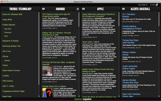
Regator Introduces Streaming Breaking News App

Regator has had its eyes on the social media and blogging trends space for the last three years, following the introduction of their blog search engine in 2008, expansion to mobile the following year, and expanding to display global trends just last year. A week ago, the company introduced a new application, reminiscent of TweetDeck and LazyScope, which they are targeting at newsrooms and bloggers who don't want to miss stories in their field as they break. The company believes that its ability to closely follow social media channels gives them the ability to deliver alerts to top stories long before they arrive on traditional sites, helping writers get their stories out ahead of competition.

Meanwhile, if you're not shackled by the AOL Way or at a post mill like some of the major blogs, as a consumer, the new app can simply be a fun way to stay on top of the top news on topics you care about, cascading down your stream in a multi-column Adobe AIR app, with Growl alerts bringing new additions to your attention immediately.

Regator's Breaking News Service on My Desktop

With TweetDeck nearly three years old, the environment of a chronologically-ordered multi-column AIR app is very familiar to most. Regator mines its content repository, surfacing alerts from many different fields, including Entertainment, Sports, Politics, Fashion, Travel, Food, Tech and more, and more specifically, trending topics for all of the above, including subcategories like Social Media, Gadgets and Hardware for Tech, or Astronomy, Chemistry and Physics for Academia. You can also add columns for search terms of your choosing, and with the pro application, a Notes tab, intended for journalists sculpting stories discovered in the program.

To get the best handle on the app, I'd recommend starting with top trends in a major area of your interest. For example, my "Trends: Technology" column shows news of the day, from Research In Motion and LulzSec to more consistent updates from the world of iPhone, Android, Yahoo!, and yes, Angry Birds. Clicking any of these specific topics opens it up in a new column, so if you've got a beat that is interested in three or four major topics, you can just leave this app open and let the stories flow.

Top Stories on Samsung Galaxy Tab and Apple in Regator

In years past, I got excited about products like Lazyfeed, which did more than just follow individual blogs you had subscribed to or friends you followed, but topics you selected, and its partner, LazyScope, which combined quasi-RSS subscriptions to the Twitter experience. Regator has delivered an app that uses social as its content repository, but presents it in a way that is much more like a news wire than a social service. So you won't see which social media personality made a story popular, or any traditional social actions, like retweeting or favoriting. Just raw content with links to the source. It's a great way to get caught up on the news you like without having to suffer through all the topics you don't.

A limited Web version of the service can be seen at http://breakingnews.regator.com/recent/, showing breaking news in the topics you select or more global content.You can also get the app on the site by going to https://breakingnews.regator.com/manage/ and clicking "Download Desktop App".

OneTrueFan Introduces Friend Ranks, Improves Badging

If you've been running the OneTrueFan bar to follow your activity around the Web, as I've long extolled and done myself, you've gotten used to the ease of sharing great content downstream and racking up achievements, as you work your way to the top of sites' leaderboard. Today, the service introduced an array of visual enhancements which makes advancement more apparent, but more importantly, connects with your external social networks to find how you rank, not just globally, but against your friends as you travel through the Internet.

Now, instead of simply seeing the global OneTrueFan leaderboard for any site, you can now toggle between this ranking and a "Friends" ranking, which taps the connections you have made on Twitter or Facebook, surfacing the avatars of your buddies, giving you an even better idea of just what your friends are doing online, and what sites they find valuable. This way, even if you're a house hermit, you're never truly browsing alone. You can also now, for the first time, invite friends from Twitter and Facebook to join you on that site via the leaderboard, with a few clicks.

OneTrueFan Now Divides Friends From the World's Rankings

In addition to the friend segmentation, OneTrueFan also made a number of visual tweaks, most apparent to frequent users. Instead of a one-time bar flash that updates you on achievements, the message icon now glows red. When clicked, your most recent accomplishment, from the "Thanks for Sharing!" badge to achieving multiple levels from engagement, to achieving the much-desired OneTrueFan status, will be displayed in a larger, rectangular window, attached to the OTF bar.

The New Badging System on OneTrueFan

The enhancements are pretty slick and welcome for all existing users. It's always fun for me to find which sites my friends visit, and I'm often surprised when I find unexpected people in unanticipated places. The OTF team, on the heels of their excellent analytics package I discussed last Friday, continues to roll out useful updates.

June 15, 2011

Tech Leaders Don't Win By Saying They'll Crush Somebody

The best technology companies in the world, be they in hardware, software or Web services, didn't get there by brashly saying they were going to take out #1, kill them or stomp on their grave. If you think about it, or do your share of reading up on Web history, you'll find that for the most part, the companies who we associate with leadership, be it through quality, market share or traffic stats, reached their position with a near purity of thought on their ability to deliver something new and differentiated. So when you read about company X targeting company Y or setting up to take them down, you can almost guarantee they either won't make it, or company Y is going to change the game again.

In the last few weeks, I've been doing a lot of reading on Silicon Valley history - away from the day to day news releases and rumor mongering, but a few years to a decade back in the past. I enjoyed reading "In the Plex" by Steven Levy, which walks through the rise of Google, and am nearing the end of "The Facebook Effect" by David Kirkpatrick, which goes beyond The Social Network's fight with the Winklevii and walks along Mark Zuckerberg and team as they try to change the world. In years past I've enjoyed plenty of books on Apple, Oracle, Microsoft, AOL and other tech titans, with similar paths.

In the recent cases of Google and Facebook, what you don't see is a lot of crowing about how they plan to "take down" Alta Vista, Yahoo! and Excite for the first, or to crush Friendster and MySpace for the second. In fact, as Levy points out, Google tried to sell itself to Excite in the early days, only to be turned down due to the engine's accuracy being so high it would reduce pages for ads to be displayed. Facebook quickly morphed from a single university system to a march on openness and increased social connections.

In Facebook's case, the failure of Friendster helped the company focus on system reliability to avoid issues that badly damaged the social pioneer, and contrasts with MySpace were common during the network's growth. But you don't see Zuckerberg targeting number one. Instead, he wanted to build a new platform with a higher mission.

Extend this to the world of mobile phones. If you remember the initial launch of the iPhone, Apple didn't talk about being the majority leader in market share. Instead, Steve Jobs set a target of one percent market share by 2008. Sure enough, in 2008, they reached 1.1 percent. (See: Ars Technica) They clearly beat that 1 percent goal, and kept going.

So when I read about challengers taking on big targets and swearing they will surpass them, I can't help but be skeptical. For example:
There are many many examples like this where the hubris outweighs the reality (all deference to the hardworking folks trying to make this happen). In 2008, I wrote that those talking about taking down leaders like TechCrunch and Techmeme only further proved how hard it is to be on top. In January of this year, I said there were no iPad killers, only alternatives. Don't get me wrong. Our iPads seemingly exist just so my kids can watch videos, while I'm much more open to using the Galaxy Tab, but I don't expect iPad sales to go anywhere but up for a while.

Look at who is on top today in whatever category makes sense for you. Social networking. Search. Mobile OS. Tablets. Storage systems. Operating systems. Printers. You name it. You would be hard-pressed to see those companies having talked big about taking down number one when they were on their pathway to success. They probably didn't do it at all.

I never saw Google commercials mocking Yahoo!. I never saw Facebook taking potshots at MySpace. Those throwing stones now should do what the big guys did to get here - focus on their business and do a fantastic job executing on something users really want. If they do, and they get a chance to get noticed, then they will get a chance to be number one. While bravado is fun for internal sales rallies and personal goals, it's probably not the best for a public press position. And those companies who are going to be the next Google, Facebook, Linkedin, Apple or who knows what... they're probably going to creep up on us and not tell the world they're going to do it. Just watch.

June 10, 2011

Quora Hits the Shuffle Button for Q&A Randomness

The stickiness of Quora for engaged users has been the ability to rapidly find discussions of interest on topics you've selected to follow, or from people you've connected with on the network. But while that alone can provide you with plenty of both information and entertainment, the question and answer service took a queue from services like iTunes, Tumblr and StumbleUpon by adding a Shuffle function tonight, which brings you to random pages within the site. Let the hilarity ensue.

The Shuffle button, which appears at the bottom of any question and answer page, has three options, including showing both questions and answers, showing only open questions which lack answers, or just showing answers. You can also get to a random Quora page by going to the dedicated URL: http://quora.com/shuffle. Quora cofounder Charlie Cheever credited the new feature to two Quora employees, Shu Uesugi and Tracy Chou.

Quora's New Shuffle Button In Action

You Can Select What to See When You Shuffle On Quora

Using the Shuffle feature brings you to a random page on Quora, on any topic, be they posted by friends of yours or not, in topics you may follow or those you don't. Like StumbleUpon, there's certain to be a high bounce rate of people scanning quickly and hitting the "Next" button to get the next Shuffle. But it does have the option to spring people out of a self-reinforcing echo chamber and being exposed to more serendipity. No doubt Marc Bodnick loves it. Start shuffling at http://quora.com/shuffle.

Chromebooks Poised for First Look Under the Microscope

Google's browser-centric Chrome OS will be getting its first reviews from those outside of the company's beta program starting this week as units from Samsung and Acer reach the first buyers on OEM hardware. Already, reviews have started flowing in, with the first observations offering a mixed set of feedback, as many struggle to find a way to assess the products - either comparing them to traditional OS-based laptops, or thanks to the pricepoint, against low end netbooks.

Unsurprisingly, the responses are typically positive about the ease of use and access, but eyes are quickly drawn to what's missing, namely, the host of traditional software applications that live beyond the browser today.

Browsing my Mac Mail on Chrome OS With Google Music Playing


When launching a new product into a very crowded space with tons of history, a new challenger needs to determine a few things, including:
  • Does the product accomplish something altogether new, never done before?
  • Does the product improve upon existing systems in capability or performance?
  • Does the product save people money while offering similar capability?
For those curious about ChromeOS or iOS or Android or any new technology, the basic questions revolve around whether the new product will help them achieve more, or avoid problems with what's already in place. In my initial review of the beta CR-48 unit, I said the browser lock-in felt like I "had been placed on house arrest," adding "serious efforts will need to be taken to convince people why putting everything in the cloud, and abandoning (for the most part) applications they know well, will help their lives." This is the age-old conundrum of marketing in general - tell us why it's better, not just that you've introduced something, but why this will help me.

In the ensuing months, I have increasingly been using my ChromeOS notebook (and am writing this post on it now, while streaming tunes on Google Music). The device's built-in 3G connection, thanks to Verizon, and incomparable battery life has made it a must for events and practically any time I leave the house. I've taken to calling it my "car computer", much like the carphones of old, as instead of lugging a heavy laptop bag complete with power cords, I just put the CR-48 under my arm and then place it on the passenger seat. I'm often stopping before or after meetings to use the laptop from the parking lot, or catching up on email before I drive to the next place. It's incredibly convenient. That said, it's still playing the role of the "second computer" for me and will likely for most people until they get more accustomed to cloud-based Web apps, and as those apps increase in number and quality.

Google's team hasn't said ChromeOS is for everyone. For designers bound to Final Cut Pro and PhotoShop, abandoning those apps is a practical impossibility. At Google IO the company instead spoke to the worker bees who primarily use their company laptops for email, Web access and word processing, all of which can be done on ChromeOS with solid quality, even if Google Docs still takes some getting used to for the Microsoft Office whiz. The company's initial marketing forays speak to fast boot up (which is yes, very fast), the elimination of viruses so common on Windows (but don't scare most Mac users), and the future being the Web. As I wrote on Tuesday, the definition of cloud differs between tech companies these days, but Google's approach, where all user data is on the Web, and the hardware is interchangeable, seems the most pure.

My Current Array of Browser Apps Is a Start for ChromeOS

A Web centric world is one that takes some getting used to, but once you've gotten used to having 3G networking everywhere, and battery that goes all day, typical limitations seem substandard. My wife borrowed my CR-48 to take with her to a meeting at church (which has no WiFi) and while on 3G, she was able to download the membership directory and edit a spreadsheet for upcoming meeting schedules. On the CR-48, all we had to do was make a new user for her on my machine, tied to her own Google account, and her activity didn't get in the way of my own.

Initial feedback on the CR-48's flaws, including the much-maligned trackpad and perceived pokiness, have pretty much been eliminated after months of quick driver updates over the air. I now routinely have Google Music running in one browser window, Seesmic or Twitter in another, and in a third, multiple tabs open to my multiple email accounts. Instead of a cluttered interface, however, Chrome OS has adopted to let me quickly rotate screens, either from a dedicated key for "Next Window" or the familiar alt-tab, used more commonly to switch apps in Mac or Windows. And knowing what I know about Samsung's high quality hardware, which is behind my Android tablets, my Android phone and the TVs in our house, I am looking forward to seeing what they do with their first Chromebooks.

With this first volley, you can anticipate media reaction, which will no doubt be eager to claim success or failure of the project, with box counters and trend spotters alike looking for initial sales numbers and market share penetration. My bet is you won't get sales numbers from Google directly, while Samsung, Acer and others will give insight into the results, or Best Buy might report the data from their online store. It's also extremely likely that Google is in this game for the long haul. Chrome is one of the pillars of the company, so if there is anything resembling slowness, they'll listen and iterate fast, as they're known to. Meanwhile, you can look forward to headlines like those from PC World who eagerly said Chromebooks are "doomed to fail". Everybody wants their bets in early, in the chance they might be right.

What I know is that after initially relying on MacBook Air for more than 90 percent of what I do with my laptops, the Chromebook is taking more and more of my time and it's liberating to take it with me to the park or anywhere I need to go and know my data and my Web will be with me. I look forward to apps I've had to leave behind, like Spotify and others, making the leap to the Web and away from the desktop metaphor. I'd bet, just like the transition from Mac OS 9 to Mac OS X a decade ago, those laggards will get there. And you just might see people increasingly taking to Chromebooks for low-cost access to the Web.