July 31, 2011

Keep Up With Your Fantasy League on Google+


With the NFL lockout over, sports fans everywhere are ready for the most important passage of the fall - not kickoff, and potentially not even the baseball World Series, but the start of this year's Fantasy Football league - from drafts to weekly results, and most important, trash talk.

Google+ Circles are the perfect place for your trash talk. Why? Because you can create a Circle with "My Fantasy League Buddies", and talk trash all day long just to them, and nobody else has to see it. You can complain about how your first round drafted Running Back keeps getting replaced at the goal line by some useless backup, or how your first-string quarterback got a concussion in Week Two. By all means, live it up, and you don't have to feel guilty about polluting the rest of your streams by talking all the crap you want about your team that deep down you've always wanted to, but felt limited by the way every other social networkhandles itself.

Even better than this? Why not use Google+ Sparks to follow your players?

If you draft Aaron Rodgers (who went to the same high school and college I did) as well as Arian Foster, you can save Sparks for both players, and click them whenever you want to make sure you get tips on unfavorable matchups, injuries or game results.

Now, obviously, Google+ is not going to be the home for your Fantasy League outright. There's still ESPN and Yahoo! Sports and CBS Sportsline for that. But none of those places offer the kind of communications platform this place does, and the option to share as much or as little as you like. Because as all of us fantasy gamers know, even if you're stoked that Maurice Jones-Drew went for 130 yards and 2 TDs, the rest of us don't care.

Nobody Cares about Your Fantasy Team -- except you. Why not make a Circle and run it here?

/via My Google+ Profile.

July 30, 2011

How My Stock Got Reverse Split 22,000 to One

A lot of stories are written about companies that do extremely well, or people who have struck it big. Those are fun. But even in the Silicon Valley, there are stories that didn't go quite so smoothly.

Back in 2001, I joined an innovative new company that was going to go head to head with large established firms like EMC, NetApp, Dell and IBM. We had new ideas and a great feature set with big potential customers lined up. I was given 15,000 stock options for my role as a Marketing Manager, which optimistic colleagues used to point to the crazy P&E ratios of the time to expect that if we met plans, could be worth not just millions, but tens of millions, someday.

But for a variety of reasons, both due to our own issues, and global economics, initial growth was way behind expectations. Our losses were high, and we found ourselves needing to go out for another financing round at a much lower valuation by 2003. We raised plenty more money, but those initial shares I had were reverse split 550 to 1. This meant my initial 15,000 shares were now a shade over 27 shares.

By 2005, we went back to the well again, and got more funding. Those 27 shares were reverse split a second time, this time at a ratio of 40 to 1. That left me with less than a single share from my first allocation (15,000/22,000), so even though I'd vested all four years' worth, the finance team rounded my fractional share down to zero.

In my 12+ years in the valley, I've been hired, promoted and laid off. I've raised big rounds of funding and seen them go up in smoke. I've filed for IPO and withdrawn it, and seen companies talk acquisition, but then decline. That's part of why I still fight for startups when I do, and why I try to add a little more depth when I write about companies big and small. I've got the gray hairs and scars from having lived this... and I'm no armchair quarterback.

/via My Google+ Profile.

July 29, 2011

Topify to Go Dark as Twitter Claims Another Dev Victim

Back in 2009, Topify emerged with detailed Twitter follower notifications, which made the service useful at a time when Twitter's own notifications were text only and didn't provide any information about the user. Created by Ouriel Ohayon and Arik Fraimovich, the app made it easy to send direct messages through email replies and bumped up its feature set later in the year to include follower details in the subject of the messages after Twitter similarly went to detailed HTML in their own updates. But in the last two years, as Twitter has expanded its own feature set, the company has continued to have a rough time satisfying developers, who see changes made by the microblogging company appearing arbitrary and without warning.

Today, after a week's worth of frustrations, following a change to Twitter's back end which stripped required headers from emails available to developers, Topify said they are going to be shutting down the service, rather than chasing after Twitter's continued meandering API roadmap.

An unhappy notice from an unhappy developer.

In an email sent to all registered users, saying the service would be discontinued on August 5th, Arik wrote that the company had decommissioned "X-Twitter headers", pushing developers instead to the Streaming API. In Topify's case, Arik said, the only option was to use a "Site Streams" version of the API, which is in beta and has no exit date. With clear frustration, he said he was done playing around.

"Considering this last episode and other actions by Twitter in the past year, I have no desire to expriment with their beta offerings. Not only this can result in unstable service for you, they might just shut it down one day," Arik said. "Topify was conceived as a response to long frustration with useless emails. Emails that you couldn’t process from your inbox, emails that had very frustrating mobile experience. Topify was sort of experiment, to see if it can be done better. Judging by your response and adoption, the experiment was successful."

As Twitter has grown, and the user base has shifted away from geeky early adopters, Twitter employee Phil Pennock (@syscomet) said a higher population of their users are marking incoming email as spam, even if they had requested it themselves, making email for push notifications, unreliable. He adds in a discussion on the company's developer site, "Email based trigger notifications sound great in theory and work well at small scale, but there's too many parts in the control of too many parties to debug and deal with false signal feedback. You'll have happier users with more reliable software, by not relying upon mail."

With that move, Topify's users won't get the chance to mark inbound notifications as spam because the service will be going dark a week from today - just another chalk mark on the prison wall for developers who turned to Twitter as a platform during the service's lean days a few years ago.

July 27, 2011

Living On the Web With Chromebook Good for Battery Life

Samsung's Chromebook Has Become My Primary Computing Device

For all the noise I made last year about switching my mobile phone from iOS to Android, in 2011, I am thinking about and using ChromeOS even more than Android of late. As Android works through its growing pains as its handsets give way to tablets and as much news is unfortunately about the legal battles being played out with ecosystem partners battling entrenched competition as continued innovation, ChromeOS has trickled out with Samsung and Acer as its first OEMs. No doubt the earliest models aren't yet putting too much fear into established PC market share unit leaders, who have to be watching the developments with some interest, but as someone who lives on the Web, and has access to the first model from Samsung, it's clear to see how the concept of a Chromebook provides value. As I mentioned in my initial frustrations with slowness on the MacBook Air after I installed Lion, I have increasingly been using the Chromebook as my primary computer, and for good reasons, primarily centered around incredible battery life, easy access to connectivity, synchronization of content and rapid improvements.


Google Music, Reader and Google+ Updates Flowing In on Chromebook

Today, I ran a little experiment, not intended to be scientific, given the relative age of my 2009-era Macbook Air and the comparative newness of the Samsung Chromebook, but I decided to go power cord free on both machines, starting with the Air, using both normally, and see just how much different the experience was between the two. The Air, which I used much like the Chromebook, primarily for e-mail, social networking, playing music, etc., the battery ran down in almost exactly two hours of continued use (from about 9:25 to 11:25 am). After grabbing lunch and driving over to Teens in Tech headquarters in Mountain View, I brought only the Chromebook and used it through the afternoon and later in the evening, starting at 1 and continuing through about 9:15 tonight (with only about 30 minutes when I didn't use the laptop). The Air gave me two hours of battery and the Chromebook provided more than seven - a stark difference.

My Standard Chrome Apps, Bookmarks and Frequently Viewed Pages

But obviously there's more to the device than a nice battery and a relatively low price that puts the device in line with Windows netbooks and Apple's iPad - which detractors have said makes the Chromebook's Web-centric model fall short. Their argument, which I've bumped into time and again, is that by springing for about $400 to $500 for a souped-up Web browser, you might as well get a full operating system and hard disk thrown in to boot. Other folks, like Harry McCracken of Technologizer, have found adjusting to the new environment a challenge.

A Google-centric answer would say that the Web is the future of where traditional apps are going, and the opportunity to not have to worry about Windows' famous service packs and vulnerabilities is practically worth the price of admission. Bundled with a cloud-centric world where you can get all your files on any computer, theoretically, just where you put what document in which folder on your local disk seems somewhat antiquated.

The Rise of Web Apps Makes Web-Centric Computing Possible

The truth of course is that both arguments have merit. One's choice comes down to keeping what's worked in the past, with the desktop OS, application, folders and files structure intact, or making a calculated risk to try what's new as the story evolves in real time. And yes, the Web has evolved to the point that applications which once ran on the desktop now run in the browser. This means that when I take my Chromebook around with me, assuming Internet connectivity, I don't "just have a Web browser", but instead, I have access to all my documents, spreadsheets and presentations on Google Docs, all my email (with Gmail or MobileMe), my music on Google Music, my RSS feeds in Google Reader and access to all my financial activities between eTrade, Wells Fargo, Chase online and PayPal. If I want to rent a video, I can turn to YouTube or the Android Market. Obviously I can do all matter of shopping and social networking on the Chromebook as well. So I haven't exactly felt any kind of drop-off in productivity as the Chromebook has taken over upwards of 80% of my computing time.

My computing reality is that for the last several months, my Macbook Air has been getting increasingly slower, and the fan runs most all the time. Despite my trying to babysit the machine, the old truth that hardware gets sluggish the more you use it seems to prove itself once again. In contrast, as Chrome continually updates the browser and pushes incremental revisions that can get updated on the machine in a matter of seconds, it seems my device actually gets faster as it gets more capable. When I attended Google I/O this year, the two-day presentation was broken into two parts, the first day focusing on Android and the second day focusing on ChromeOS. It was day two that I found more impressive, more about delivering change, rather than establishing where the company's growing installed base was versus iOS in numbers.

Lucky as I am to have access to multiple environments, I am increasingly leaving my Macbook Air unused or behind in favor of the Chromebook thanks to the new device's much-improved trackpad, fantastic design, professional keyboard rivaling Apple's efforts, and the incomparable battery life, which I'd only previously seen attained from tablets like the iPad and the Samsung Galaxy Tab. The Chromebook has evolved from being a curiosity to playing a role as my main mobile device to my primary device. I still turn on the Macbook Air, of course, primarily for focused PowerPoint work, Photoshop, and my continued OCD over organizing and archiving email, but it's becoming the backup. Even if I were to head to an Apple store tomorrow and buy the newest, faster model, it wouldn't come with 3G connectivity, as the Chromebook does, it wouldn't come with ten-second bootup, and the battery life that really goes all day.

The Chromebook isn't for everyone yet, but it's a serious alternative that I can see being very attractive to workplaces looking to get an inexpensive uniform standard for employees, for parents getting first machines for their families, and for any mobile worker who wants the machine to go all day without chasing down power cords. There are certainly skeptics out there about what role the Chromebook plays in a world of cheap PCs and powerful tablets, or others still who think comparing a Chromebook to a Macbook Air is pure foolishness. But I vote with my actual use of these products, and I can only tell you what I'm seeing and enjoying. Samsung has done a great job with their first volley, and I'm spending all day in my Web browser - an extremely flexible one.

Disclosures as always: The Chromebook was provided free of charge to Google I/O 2011 attendees.

YouTube, Reader's UX Maven Jenna Bilotta Highlighted

The Citizen, the local paper in Fayetteville, Georgia, offers a fantastic profile of one of the sharpest UX designers I've ever met.+Jenna Bilotta , who is the brains behind Cosmic Panda, the latest YouTube design experiment, previously flexed her creative power on Google Reader, where I've spent more hours over the last four years than practically any other place. Great to see someone without a CxO or VP title getting some well-deserved recognition.

Congrats, Jenna!

July 26, 2011

Podcast: Social Media, Athletes, Twitter and Google+

Athletes have taken to social media, specifically Twitter, in droves, using the network as a way to quickly connect with fans and press without traditional media filters. As Twitter became more visible and top celebrities from Hollywood took the network, athletes soon followed - with Shaquille O'Neal being among the first and biggest name to make the service part of his arsenal. With the unfiltered capability upon them, athletes have often made mistakes for updates to the network, and it's possible some regret saying many of the things they have. With the advent of Google+ from Google, Chris Peoples asked me to join him on a regular podcast he calls "The Peoples' Court" to discuss how athletes could benefit from Google+ and what to expect in terms of adoption.

As I mentioned on the podcast, athletes are not the fastest adopters, but if history repeats, they may follow the Hollywood celebrities to the network, and find value in limited distribution of content via Circles, dedicated Hangouts with family, fans or press, and unlike Twitter, the option to not only post in long form, but to edit content after it has been posted. Until Google+ is open to mass registration, I would expect uptake from athletes looking to use the medium for marketing to be slow, but once the doors open, it could be a very different story. Per usual, I had some audio difficulties on the call, so if you don't mind skipping through occasional static, you might enjoy our discussion, embedded below.

July 25, 2011

Techmeme Leaderboard Features Google+ Users

The content being created and shared on Google+ is quite good. So much so that many posts that have originated here have been featured as leading articles on Techmeme, the much-watched technology news curator led by +Gabe Rivera. While Gabe and team have had Twitter activity play a role in the site as well, no other social network (Facebook, FriendFeed, Google Buzz, etc.) has previously gotten this level of visibility.

Google Plussers +Paul Allen and +Danny Sullivan have seen their content shared on Techmeme frequently enough that both are listed on the Techmeme leaderboard, which tracks the most frequently carried sources on the site over the last 30 days.

You can see all Google+ stories that have entered Techmeme here:
http://techmeme.com/search/query?q=sourceurl%3A%22plus.google.com%22&wm=false

I would not be surprised to see +Vic Gundotra and +Bradley Horowitz be listed at other times on this list in the future.

/via My Google+ Profile.

Blogger Enables Static Pages to Link to External Sites

As part of my most recent blog redesign, I added a number of static pages which contain some of my most popular posts, my work history, disclosure badges and event history. Since then, Blogger revamped its publishing back-end, mirroring the design upgrade also seen at Gmail and Google Calendar, as Google extends its recent efforts to enhance the user experience. Somewhere in that mix, I overlooked the added capability to make these static pages not require native content on the blog, as they can also link to external sites. This option was pointed out by George Moga today on his blog, and I've already gone ahead and leveraged his tip.

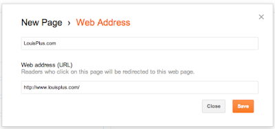
If you are a Blogger user like I am, you can modify your blog template to include this feature by going to draft.blogger.com. Select "Pages" from your blog's overview section, and then hit "New Page" to make a new page, hosted or linked. There are two options - the first being a "Blank Page" for your own content, and "Web address" for the link itself. Simple.

My List of Static Pages on Blogger, Now With LouisPlus.com.

Linking to LouisPlus.com with a Single URL in Blogger

Recently, I acquired the domain name LouisPlus.com for my Google+ content. To be honest, my good friend Drew Olanoff (who also owns DrewPlus.com) bought it, but he promises he'll let me use it. :) In addition to the Google+ icon in my left sidebar, I've now added a link to LouisPlus.com in the header of my blog, thanks to this new redirect feature. So if you're somebody who wants to link to "My Company", or a social network of your choosing, or really anywhere, it's very simple. No hacking needed.

Twitter Search Gets Modern Facelift, Index Still Limited

Since Twitter acquired Summize way back in 2008, the company's search engine has been one of the biggest question marks - for while use of the network has risen dramatically, the company has been unable to keep historical data beyond a few days. Recent enhancements, which Twitter termed personalization, help to separate quality updates from junk, but for the most part, the situation with the search engine remains the same. Today, the search engine saw flickers of life with a design revamp that brings the front-end of the engine in line with Twitter's newish Web interface. It also brings forth the "Promoted" search queries which the company is relying on for revenue.

Over two years ago, I talked about how Twitter's search engine became increasingly less useful over time thanks to a shrinking index and oddities, like being unable to find any tweets from specific users, or missing data, even when search operators were used. At the time, I asked if this would be a "temporary blip" which I hoped would "come back soon", but the company has prioritized other features. In the meantime, a deal with Google to provide realtime updates in their search results lapsed. So we're still stuck with the few days of results, just in a prettier format.

The new Twitter Search Front End, Including Top Trends by Your Geo

In addition to the cleaner look of Twitter search, the service also has a new example pop-up for search operators. While the practically ancient "flight :(" example held over from Summize remains, new are example searches including "from:alexiskold", "to:techcrunch" and "@mashable", nods to the GetGlue founder and top blogs who give Twitter a lot of press.

Also included? The optimistic operator: "superhero since:2010-12-27" which says it will return results "containing "superhero" and sent since date "2010-12-27" (year-month-day)". If you do run that query, you'll get responses dating back all the way to July 23, 2011. Where the rest of the 7 months' results are is anybody's guess.

Search Operator Options on the New Twitter Search

Despite one's social networking preferences, the data inside Twitter is extremely valuable. The company really could have a lead on being the realtime pulse of the planet. This makes prioritizing new tweets the most important, but I'd bet the world could benefit from more than a week's worth of content.

Google+ Follower Counts Jump, Due to Simple Circles

A lot of people here, from +Brett Crosby to +Erica Joy+Loic Le Meur and more have noticed the number of people adding to them in circles has caught up to or exceeded their followers on Twitter, despite Google+ being out for just under a month, while Twitter just celebrated its 5th anniversary. Many of us joined Twitter 3-4 years ago. +Liz Gannes of AllThingsD has an analytical post today on just why she and her connections think the counts are the way they are.

My two cents: Adding people to Circles is fun and simple, and you know you can organize people who you might view less often, while with Twitter you put everybody in the same bucket, so you pay a tax for connecting. Also, the engagement here is such that we early users are enthusiastic about following the path forged by other social networks, and finally getting the equation right.


(See: Google+ Really Has the Hang of the Follower Count Game)


/via My Google+ Profile.

eWeek Discusses Algorithmic Filtering, Google+

+Clint Boulton of eWeek extends the conversation that +Tom Anderson and I initiated last week regarding Google+ and algorithmic filters. I'm still not used to seeing my name in a headline at such a great publication as eWeek, but I assume it's the result of my talking so openly about a product lots of us are excited about.

Thanks for the post, Clint.

See: Louis Gray Argues for Algorithmic Filtering on Google+

/via My Google+ Profile.

July 24, 2011

Patents: True Innovation or Trolling?

When I first started working in the Silicon Valley, I held patents in the highest of esteem. I was in awe when I would see inventors' walls speckled with plaques, and believed they reflected true innovation. Later, the companies I worked for went through the somewhat arcane system to have their own discoveries recognized. But in 2003, NetApp acquired a set of patents from Auspex and sued BlueArc (where I worked). Though our products were obviously very different and we were not infringing, the battle took lots of our employees' time, the case was used against us with customers, and millions were spent in legal fees, before it was dismissed in 2007.

Now, the words I think of after patent are either "suit" or "troll". I see how Apple, a company I once held in the very highest esteem, is attacking companies like Samsung, HTC and others with patents made well before the devices in question were created. I see others defining basic elements of Web services and cringe at suits to come. The system is broken. +Chris Sacca talks about one firm, Intellectual Ventures, who will probably be at the center of some of these future fights, in a detailed article on NPR.

(See: When Patents Attack)

Interested to your own thoughts around patents, invention, legalities and innovation, or what experiences you've had.

/via My Google+ Profile.

July 23, 2011

Automating Spam Removal Is A Tricky Challenge

Automating the detection and removal of spam accounts, fake profiles and other similar tasks is a tricky one. Assuming you have a 99% detection and response rate, the 1% "false positive" can be a humongous headache. With many people debating the right approach to taking down accounts, flagging spam and the like as this network evolves, check out this great article from the oddly titled "Laughing Meme".

See: Cost of False Positives on Laughing Meme

/via My Google+ Profile.

Cracking the Code on Logo

In elementary school, we had about 4 or 5 ancient Apple II/e computers, which were used to keep kids busy if they finished tests early, or for running the LOGO program. While many of you may remember LOGO, for the younger set, it entailed a triangle shaped "Turtle" that performed the actions you told it, including going forward a certain number of spaces, rotating a certain number of degrees, and so on. If LOGO was programmed correctly, you could make all matter of designs.

Our science teacher at one point gave us a simple task - to make a perfect right triangle with LOGO. A lot of people came close, but it was hard for our elementary school brains to tell the turtle to draw a line that was precisely the right length hypotenuse. A few decimals here and a few decimals there, but nobody quite got it.

Then I realized we were doing it the hard way. I told the turtle to go forward 30 (a standard measure), turn right 90 degrees, go forward another 30, making the two straight edges, and then entered the command of HOME, which made the turtle do it all by itself. I then hit HT (which hid the turtle) and on the screen was that perfect right triangle. The science teacher was annoyed, but had to admit I had cracked the code.

/via My Google+ Profile.

July 22, 2011

Sonos Shrinks Wireless Sound Systems With Play:3


Sonos' mission is to deliver the highest quality music from any source to any part of your home, wirelessly. The company's beautiful Apple-like speakers have played a major role in my home's decor for the better part of 18 months, ever since I got my first S5, later added on two more units, and even a wireless dock to play songs from the iPod Touch. As new services like Rdio and Spotify have debuted, Sonos has been lightning-fast to support them, to get users fast access to their music. If there have been any complaints I've ever heard about the company's products, they've been price related. Something about premium quality and premium prices going hand in hand... but this week the company took a step down in the market with the introduction of the Play:3 line, which has a smaller form factor, fewer speakers, and a new profile which looks great if posed either vertically or horizontally. The new pricepoint is only $299, which should make the units even more attractive to consumers and audiophiles.

As someone who has long ranted in favor of Spotify for the better part of two years, I'm equally as effusive about my Sonos equipment - which plays a visible part in social gatherings, and entertains the kids who need to get their wiggles out by dancing to techno from all sorts of sources, including not just the aforementioned Spotify and Rdio, but also Sirius XM, local radio and topical content from the Web's deep library. Managing the now four devices (3 of the 5's and one of the 3) is simple with the intuitive software for both desktop and mobile, and it still amazes me to have the near instant response from an action I take on the app impacting the wireless speakers anywhere in the house.

How small is the Play:3? My 10-month old can straddle it.

With the introduction of the Play:3, Sonos is rebranding its equipment in a much simpler way than in the past. Gone is the letter and number pairing of the S5, replaced by the Play line of players and the Connect line, including the ZoneBridge and ZonePlayers that turn existing speakers into wireless systems, or connect your routers to your Sonos equipment.

When the Play:3 arrived at our door this afternoon, the twins opened it up and said "Dancing!" when they first saw the unit. So yes, they know what it's for. In about 3 minutes, the device was connected to power, added to my desktop software and streaming music. It's simply not fair how easy it is and how good it is to get such high quality sound from such a small device. It's a smart extension of the product line I've invested in after first getting introduced to Sonos early last year. Huge win.

Disclosure: The Play:3 was provided free of charge via Sonos. I've previously purchased multiple Play:5 machines.

July 21, 2011

Look Here, Macintosh...

Look here, Macintosh. I guess you saw my blog post and are a little mad at me. All I wanted to do was go to terminal, say "top" and find out just what was eating all the memory and CPU. And now you won't let me? Bring it on. I've got two Chromebooks over here saying you're no longer the king.


Lion's Big Bite Took the Air Out of My Sails

Like a good number of fast-moving Apple fans yesterday, one of the first things I did with my day was install Mac OS X 10.7 (Lion). The update, weighing in at just over three gigabytes, downloadable from the Mac app store, delivered a crisp new UI, some nice new features including Mission Control and an iOS-like approach to finding all available apps and files, a new take on scrolling, and unfortunately for me, at least in my case, a ton of slowness. From what it looks like, my poor refurbished 2009-era MacBook Air simply wasn't macho enough to run Lion - even after I weighed my options and ran Disk Utility for the better part of two hours to ensure nothing nefarious was keeping the poor laptop down.

While my MacBook Air has become increasingly slow of late, and had already been sending me increasingly to my Chromebook as an alternative, Lion pushed it over the top. Warnings about Lion probably needing at least 4 gigabytes of RAM, while my Air has a pesky 2, look to have been founded, as the system often became unresponsive and bugs appeared in a number of the apps I tried, including the venerable Microsoft Office suite.


Needing to prepare a presentation for a new client this afternoon, I was working late last evening on the MacBook Air, with only PowerPoint running. All other applications were closed (to conserve memory) and even that wasn't enough. Seeing I was getting nowhere, I bit the bullet, and uploaded the PowerPoint to Google Docs. I closed the Air and then opened up the Chromebook to work from there. Despite my high use of Google's products, I've never used Docs for presentations, and the move wasn't taken lightly. You know I'm not a heavy Docs user, or I'd probably have already told you that some time. After years and years of PowerPoint training, I'm surely much more creative with Redmond's software, even if it's not my favorite.

I haven't opened the Air since. No doubt I will, once I man up and stop being frustrated with the machine, but it's a little maddening to be obsoleted in just under two years, feeling like what I really ought to do is give Apple just over $1,500 and upgrade again to the latest and greatest Air, with an even faster CPU, more RAM, and a greater capacity Solid State Disk (SSD).

I initially got the Air in January of last year, knowing that it would be a bridge to a more cloud-centric device, especially as the hard disk came with about 100 gigabytes less capacity than my previous model. Initially, I made all sorts of attempts to avoid putting native applications on the Air, but a Microsoft Office here, an Adobe Creative Suite there, and that plan was done for in due time. At last count, the device was about two-thirds full yesterday afternoon - not in bad shape, mind you, but a dozen or two gigs beyond what I had hoped.

When I got the CR-48 from Google as part of their field trial last December, the device seemed initially handcuffing, as I felt trapped in the browser. As the hardware improved with Google supplying new drivers, and Chrome got faster, I started taking the device everywhere outside the house, and have probably been using it the majority of the time inside the house of late, especially as the Air has slowed. Almost too conveniently, on the same day as my Air was being deflated with Lion, the Samsung Chromebook from Google I/O arrived on my doorstep, giving me a sleek alternative to the air with real hardware polish. Within minutes, I'd moved my Google profile onto the new Chromebook and passed the CR-48 to my wife.

It was this new Chromebook on which I gave today's presentation - the same one that I haven't had to plug in since I first turned on the device this morning, and promises more than two hours' battery life remaining with about 33% capacity. I honestly couldn't tell you how much RAM it has, and I know internal storage is dinky, but the near-immediate bringup, followed by a successful preso this afternoon, has me seeing that as beautiful as Lion is, the makeup may be caked on thicker than Tammy Faye Baker. Part of my Apple fanboy inside is crying out in pain as I hope in vain that the Air can get restored to its former vibrant self, but I have to think this particular system upgrade was too much for it. It's fantastic to have an alternative arrive on the doorstep that very day. Obviously, the price (free) isn't bad either, but I wouldn't have even touched it, let alone stayed on all day, if it didn't deliver when I needed it to. My Macbook Air and I, on the other hand, are going to have a nice long talk about the future - even if it means a clean install or a data wipe, which doesn't sound very Mac-like.

Obvious Disclosures: The CR-48 was part of a free pilot program. The Samsung Chromebook was delivered free to Google I/O attendees. The Macbook Air I paid for (and got reimbursed from Paladin).

July 20, 2011

Upgraded Chromebook Syncs Quickly


I just took a few minutes to power up and turn on the Samsung Chromebook that arrived this afternoon after Amazon shipped it post Google I/O. Now that it's set up, thanks to Google browser sync, it's practically a clone of the CR-48, with identical bookmarks, themes and extensions.

As for the hardware, it's very light, sleek, and classy. Great trackpad. Nice keyboard. Now all I have to do is delete my account on the CR-48 and pass it over to my wife so we both have Chromebooks to match our Macs.

While Apple may not be a huge fan of Samsung, I've grown to be over the last two years especially. They make great TVs, tablets, phones, laptops... you name it. If you're buying in to the Android and Chrome ecosystem, they do a solid job.

/via My Google+ Profile.

Google+ Reaches Twitter Followers 50x Faster

It took me three years of activity on Twitter to reach 19,000 connections. On Google+, it has only taken three weeks. While follower counts are not the most important thing to focus on, it is a definite indicator of momentum. Just wait until these doors fly open to the world and they find this place without limits.

/via My Google+ Profile.

Real Valley Stories: Nearly Quitting Over URL Structure

Editor's Note: Part 4 in an irregular series of stories from my 12 years in Silicon Valley. Part 1 discussed interviewing for my first job. Part 2 discussed the role. Part 3 talked about my boss getting let go while I was retained by the sister company.

At my second job in the valley, I had the title of Web Marketing Manager. It meant I owned the company's Web sites, including content, look and feel, search engine optimization, and more. Beyond that, given it was a startup, I did my unfair share of quality assurance, product planning, including my first marketing requirements document (MRD), which was terrible, and even picked up the phone to answer support calls when they cascaded to me. The company initially started out selling a web-based fax service, which was the majority of revenue for the entirety of my two-plus years there, but that line wasn't particularly sexy, and it wasn't the end goal, as we later rolled out a Web-based phone conferencing service, with Web meetings and advanced desktop sharing. The eventual goal was a suite of Web-based office products for remote workers and Web-centric employees. We were probably ahead of our time, and understaffed, but in the later stages of the dot-com boom, we were scrappy and we tried to do a lot with miniscule budgets.

After much testing, we readied the launch of our Web conference calling product in January of 2000, called PhoneCube. The application had gone through all manner of review on all the top browsers of the day, and it was good to go as far as version one was concerned. So too was all the copy for the Web site, including frequently asked questions, product overview, pricing tiers, and all manner of screenshots, complete with fake names and phone numbers. As we readied launch, my colleagues and I uploaded the new content to a test server and started clicking around to make sure all the links worked, images displayed and so on.

Immediately, as I clicked through to the product page, something caught my eye. The page loaded as it should, but the URL structure was not what I'd expected. I anticipated that clicking on Products would lead to a clean URL like www.phonecube.com/products or at worst, www.phonecube.com/products/index.html. Instead, the URL had an additional directory which looked like www.phonecube.com/phonecube_site/products/index.html. What was this "phonecube_site" deal? So I went to my boss and asked, saying we could easily make a soft name alias to hide the unnecessary and ugly directory. The two of us then went to the lead engineer on the project, who, folding his black and gray beard upward toward his lower lip as he talked, explained that this was impossible.

What had happened was that our Web site and our application were running on the same server, in parallel directories, with the phonecube_site directory showing the Web site and the phonecube_app (or some other similar name) directory powering the application itself. All of the calls to images and other code in the application had hard-coded URLs, so masking the phonecube_site directory would require dramatic work to the app itself, and delay the project.

I was incredulous. I thought the new URL structure was ugly, and it was something all our visitors would see as they clicked around our site. It would be ugly to link to, ugly to share via email, and made us look bad. In response, my boss (the VP of Marketing) said that many popular Web sites on the Internet, with Amazon being the clearest example, had ugly URLs, and yet they were successful. I thought the excuse that other sites were worse didn't really make us better. As far as I was concerned, the URL was as important as the words on the page, and as I argued my case, I started to feel that if the Web Marketing Manager who theoretically owned the Web site couldn't even have impact to how the URLs would be displayed, that my role was pretty much toothless.

After much discussion, with my viewpoint clearly being in the minority, I had to cede the position. My vain request for clear URLs that were as human readable as machine readable didn't persuade my team, and I was going to have to live with it. This realization that I could not even convince my boss to back me up on something I thought was so clear and obvious was incredibly frustrating, and I remember driving home that night, late, fuming, thinking I should just quit if I couldn't even stand up for our users and common sense. But, luckily, I decided to display a rare moment of maturity, and I came back the next day and went to work. I don't know that my boss or colleagues realized how seriously I took the fight and how I had seriously considered leaving, my powerlessness being made so transparent.

Since that time, URLs have clearly gotten uglier, and most folks have survived. I've had other conflicts at other companies, and haven't always gotten my way. Sometimes the frustrations are short-term and others long term, but what the episode did show me is that no matter of ranting and raving can push people who are certain they are right, especially when the benefits of change don't outweigh the drawbacks. I've seen other people try to hold fast to a hard line on other little things like fonts, graphics, logos, splash pages and more, where exercising a little flexibility and respect for the other person's point of view can do wonders. But back when I was only 22, getting shot down and losing a product decision I thought critical was demoralizing indeed.

July 19, 2011

Google+ & Other Social Networks Need Algorithmic Filters

Google+'s entry into the social networking market presents a new slate of opportunity for tech geeks who have been unsatisfied with leading offerings from Facebook and Twitter. The network's initial launch has been intriguing for two major pieces, namely the need to recreate one's social graph from scratch, including manual sorting, and secondly, as noted before, not starting with aggregation of third party content. The clean slate approach presents optimistic participants with a hope to "do things right" this time, and not fall into the limitations of networks past. Given Google's science-driven history, smart folks have also cautioned the company against leveraging algorithmic filters that might surface some content in the place of others.

The most visible argument was that from Tom Anderson, MySpace cofounder, who said, "Can a company so enamored with the power of algorithms and machine learning, let the user take control?", adding "... I'm worried that Google is going to make a misstep and ruin the service," through leveraging algorithms to cut signal from noise. While I have enjoyed Tom's resurgence to visibility and insights into early use of the network, I think the conclusion he reaches needs some work. Where there is signal, there is noise, and what's been missing in all networks to date is the right approach to surface quality content, which no doubt feeds into Tom's comments.

The vast majority of social networking content is consumed in reverse chronological format, with the most recent content being at the top. This is true for Twitter and all of Twitter's clients, it is true for Facebook's "Most Recent" feed, it's true for LinkedIn's news feed, and is mostly true with others like FriendFeed and Google+, which for the most part, sort content by the most recent activity - meaning older posts can be "bumped up" with additional comments. FriendFeed fought this intelligently over time, letting older posts eventually float downstream, while Google Buzz fought a similar challenge as the most visible posters' active threads initially took too much screen real estate.

In contrast to the chronological view, one can find intelligently filtered streams on Facebook, with the service's news feed, and in Twitter's search results, which try to show you "Top" content, and not just "All" content, dependent on the user sharing updates. But Facebook's approach, from my own understanding, relies heavily on your previous interaction with a person, augmented by that post's activity, which can bubble it to the top - independent of context. This means that if, for example, I share two posts, one on Apple's blowout quarterly earnings, and the second showing a cute picture of Braden at the supermarket, the posts may carry equal weight, assuming we are BFF. You can see this all the time in your own news feed on Facebook, as seemingly "random" posts from your friends surface to the top, while friends outside your top two dozen interactions almost disappear.

An algorithm that surfaces personalized content that does not take into account the many multiple factors that indicate interest, from the person sharing the content, to the content source, keywords, headline, author, time of day, time since publishing, the individual(s) commenting on that message, the keywords in the headline in combination with the author and/or the source, etc. simply isn't enough. The truth is that each of us does this automatically, and what the world needs is social networking that thinks like we do. For example, if you like financial news from the Wall Street Journal more than you like it from GigaOM, then similar stories from both should be weighted this way. But if you prefer articles on stock from Om Malik more than you do from Mathew Ingram, that too should be determined. The human brain is a very complex object indeed, but just because something is hard doesn't make it something you don't want to try.

Which brings us back to Google+. Initial content in any network excitedly rallies around itself. Soon following, one finds a backlash against meta posts, a call for the mainstream to enter the site, a fear for what happens when they do, a backlash against top users and so on. But once the fun of that is done, people behave like people and want to see interesting stuff. One person's noise is another person's signal, and unfortunately, very few people can be constantly logged in to a service. This means that when they log back in to a service, they shouldn't be forced to see just the most recent things that have happened, but instead, the best things that have happened - the content that is most important to them as an individual, the pieces of content that they absolutely did not want to miss. Because if something is especially important and relevant to you as an individual, that it came out two hours ago does not render it useless.

The advent of Google's much-discussed Circles delivers bidirectional manual filtering of people. It's bidirectional in that you are consuming from a unique list which you created, and you are sharing to a unique list of people which you created. If you create a list of "My Poker Buddies" and another for "College friends" and another for "Tech News People", the truth is that your poker buddies are going to talk about things other than poker, your college friends are going to talk about new stuff, and your tech news friends are going to talk about whatever they want... all day long. So the circles are porous. Simply naming one "Baseball" won't force people to talk about baseball, and until search is fully implemented beyond Sparks, there is no great way to find that on the site.

Another common fear about filters (which we discussed when responding the filter bubble) was that preferences are reinforcing, and that you see only what you want to see, at the exclusion of all else, that this leads to a dangerous space where you don't get access to alternate opinions. Again, I argue that we are very early in the game of finding high quality algorithm-driven personal filters for news, for social networks, or anything else we use that could benefit from personalized ranking. The solution to a smart algorithm that learns your preferences implicitly, rather than polling you explicitly for what you say you like will mean that you don't have to sift through the dozens or hundreds of posts that you deem off-topic, but instead that you get the best delivered right to you.

Unfortunately, while many companies have talked about this possible panacea, most all of them are cheating through collaborative filtering, and assuming that your social graph is smart enough to determine what is the best content for you. It's simply not true. Your interests are not my interests, and just because I like a specific topic on one day doesn't make it the most important thing the next. What is needed is a strong body of record that is tied to you as an individual, applied to your stream in real-time, helping you avoid the mess and find the best.

Google has traditionally been very cautious, going against conventional wisdom by not leveraging behavioral targeting as much as they could, by going out of their way to not overuse your Web history, your email activity, or in any other way, abusing the relationship you have with them and your content. With Google+, on both mobile and desktop, they have a new opportunity to do this correctly, continually learning more about your interests and activity to serve you the most relevant updates while avoiding much of the cruft that has plagued other networks, specifically Facebook. Having worked closely with my6sense for the better part of two years, I've seen directly how smart algorithms based on implicit feedback can make useful high quality streams out of what would more commonly be considered noise - and I've seen many people on Google+ and Twitter call for the same such filtering engine to be applied.

As Google+ gains visibility with the service opening up to more users, and less geeky users, it is inevitable that the stream content will be diversified and become more "noisy". Initial users will no longer be accepting of the content, excited just to use something new, but they will want the network to provide increased quality and connections than the status quo. While it's expected Google will eventually do a tie-in with casual gaming on a dedicated games site, the general hope from the community is that game-related info with not pollenate Google+. It's well-known that game info is a common polluter of Facebook streams, even if you've done your darndest to block all the services that hit your feed.

Tom's approach is laudable. He sees a new network with great promise, and is scared that Google will fumble it away. But I believe his conclusion is not perfect, for if done correctly, intelligent algorithms can make the network the most personal and most relevant one on the market. What Google+ needs to deliver is not just that it exists, but that it is differentiated and better. Why not use the smarts and information the company has to achieve just that?

Disclosure (as always): I am the VP of Marketing at my6sense, which provides personalization of news and social streams (but not yet Google+).

Google+: Not a Product In Isolation

Google+ may look a lot like other social networks where we've participated before, but it's not a product in isolation. Every piece has been designed to help push the industry in a new direction of interoperability and selective sharing. Edd Dumbill of O'Reilly gets it and breaks it down.

Much of the power of Google+ becoming the social backbone comes from intelligent focus on standards, from people who have pushed for standards long before they joined Google - helping move the industry from the inside out. Read the article.

/via My Google+ Profile.

July 17, 2011

My Top Ten Favorite Google Products (2011)

Google makes a ton of products. Almost two years ago, thinking about it, I posted my top ten Google products at the time. Google Reader was #1, Blogger was #2 and FeedBurner was #3. Since then, G+ has come into play, I switched to Android and Chrome is on fire. It's time for a rewrite.

The Original Post from Sept. 2009: My Top Ten Favorite Google Products

Here's what I would list now. Eager to hear your own top 3, 5, or even 10.
  1. Google+ (Obviously, this is my start page, I am here constantly)
  2. Android (The mobile OS runs my favorite tablets and phones)
  3. Google ChromeOS (Living in the cloud is a game changer)
  4. Blogger (The easiest, most flexible and stable blogging platform)
  5. Google Reader (Still the best place to follow hundreds of sites in one place)
  6. Google Search (The gold standard for finding anything)
  7. Gmail (Finally my default email, and archive. Buzz is a plus.)
  8. FeedBurner (Takes my blog to the rest of the Web, powered by Pubsubhubbub)
  9. Google Voice (Syncs my phone to the Web with auto-blocking of spam calls)
  10. YouTube (If it happened and is worth watching, it's here. Now with movies too!)
Things have obviously changed in just two years. Android, ChromeOS, Google Voice and Google+ were not on my radar much only a short time ago, and now they're essential. Curious to your own insight and what major services (Analytics, Maps, Earth, etc.) I missed.

/via my Google+ Profile.

July 15, 2011

ChromeOS Now Supports Multiple Displayed Windows

In the latest build of ChromeOS, version 751.0 for those keeping track, running on a new version of Chrome 14, the operating system has introduced a new windowing feature that lets you put multiple tabs side by side instead of the previous standard where new windows either became tabs in the browser, or went to a new screen altogether. Now, you can take notes on one side of the screen and read email in the other, or run apps on one side while keeping your favorite social network on the same screen. It brings the system even closer to more traditional OS's like Macintosh and Windows, with the exception being you're not exactly dragging windows around a screen in an up/down fashion, only splitting them left versus right.

The feeling of the new windowing effect is more akin to Apple's Coverflow display instead of being reminiscent of spaces. This means no more copying text from one screen, tabbing over to another and pasting, but also no secretly running ESPN in one screen to stay tuned to the game while working on a Google Doc in the front.

Running Multiple Windows on the CR-48 In ChromeOS (Gmail and G+)

The windowing effect comes courtesy of an icon in the top right corner in what's starting to look like a menubar, with the time, WiFi signal, battery status and now a small rectangle. When running multiple windows, you can Maximize to a full screen mode, or Restore to go back to the previous status. The two foreground windows can split screen, divided in the center, which you can pull left or right to give one more or less space. Third windows and beyond get a small sliver on the right, in the order they were opened.

Writing The Blog Post In a Notepad While Checking Gmail on ChromeOS

You can still Alt-Tab between open windows, while hitting the Window button on the keyboard (for the CR-48 at least) toggles between Maximize and Restore, instead of switching windows entirely, as it had before.

The option to have multiple windows in one screen was one that I've been waiting for, since accosting Google's Don Dodge at Google IO about the feature following day two's focus on ChromeOS. For us press people, having one window to take notes and another do post those notes or do some other task is very helpful.

Teens in Tech's Inaugural Incubator Companies Revealed

Only a few weeks away from the August 5th Teens In Tech Conference at Xerox PARC, in partnership with Meshin, a half-dozen companies founded and run by teens are preparing their sites and products for unveiling in what should be a fun Demo Day. The companies themselves were revealed earlier this week, providing a sneak preview of what you can expect should you attend. While not on the scale of Y! Combinator or 500 Startups, what the teams lack in number, they make up for in spirit and a lack of inhibition. They do believe they can accomplish anything they set their minds to, and with some aid from the more seasoned of us who can help provide some mentorship, the teams are converting their projects from whiteboards and ideas to shipping and availability for the public.

While you will hear more about each of the companies face to face at the conference, and in follow-on press, a quick summary of the participating teams is below:
  • Bubbls, founded by a team from Palo Alto, is a new social mobile application that taps into geolocation and lets your friends know when you are available to hang out.
  • BuyNomial, based in Oakland, is a new site that helps youth set savings goals through creating a wish list of products and working to budget wisely.

  • CM Studios, from Atherton, is creating a fun new game for iOS and soon Android, involving zombies.

  • Codulous, founded by a group from Santa Cruz, is a smart Web-based code editor that lets engineers work in the cloud, and synchronizes to multiple devices, including desktops, for remote access.

  • MySchoolHelp, the most remote applicant, based in White Plains, New York, but spending the summer in the Bay Area for the purpose of participating in the Teens in Tech incubator, is setting up a collaborative site for high schoolers to share class notes and get rewarded for high quality work.

  • Workcrib, from Walnut Creek, is working to provide an easy way to showcase workspaces online.
There are some obvious themes in this year's participants, the inaugural class of companies - as some are leveraging the fast growth in mobile and social, while others are tapping into the cloud for improved sharing and collaboration. The activity I've seen face to face with many of the teams in recent weeks has been quite impressive, and they can lap me in the geek front, which is a good thing indeed.

All will be presenting at the August 5th conference at PARC. As noted Monday, I have a discount code I hope you can leverage. Sign up at http://2011teensintech.eventbrite.com/.


Disclosure: I am an unpaid advisor to Teens in Tech, and have a small equity stake in the company.

Google's Data Liberation Front Frees Your +1s

In a new and innovative way to leverage the company's new Hangout feature as part of Google+, Google's Data Liberation Front held a small press briefing with a handful of tech journalists today, walking them through why the company is focused on leveraging open standards and helping users get their data out. Alongside the discussion, engineering manager Brian Fitzpatrick said the company has extended its exports to include the +1s you've made for Web sites - a small bump obviously, but one that demonstrates their seriousness about making getting your data out of Google as easy (if not easier) than it is to get it in.

Without speculating on other company's practices (namely Facebook), Fitzpatrick asked those of us participating if we would recommend a restaurant which locked its doors to prevent us from leaving after we sat down for a meal, or if we would recommend people rent an apartment that demanded it keep your furniture and family photos once you moved. The obvious answer is of course not... and Fitzpatrick said the same should be true for your online content. He recounted how when the Data Liberation Front first started with Blogger, there were some internal concerns at Google that users would leave the platform en masse for WordPress or other solutions, but in fact, they instead regularly downloaded content but kept posting - using the exports as local backup. (This is what I do as well)

Google Takeout Liberates Your Content from Multiple Services

Fitzpatrick pointed to Google Search as an example of not locking in one's data, as users, with many choices, will use the engine and can go to any other when they like. But with many online services, content goes in and doesn't come out. As I've demonstrated with my own personal backup of my Facebook wall and photos, you can get your data out of the social network, but it's possibly not configured very simply to move to another platform altogether. This is a main focus for the Data Liberation Front team, said Fitzpatrick, who said the effort is made to point to XML, Activity Streams and Microformats wherever possible, letting your data be interchangeable within services.

Downloading My +1s is a Mere 25KB.

Now that My +1s are Downloaded, I Can Move them Elsewhere

Lost in much of the coverage of Google+ a few weeks ago, the Data Liberation Front introduced its Google Takeout policy on the same day, making it easy to download data from multiple services and take them elsewhere. This list includes your +1s now, as well as Google Buzz, your Circles and Streams from Google+, and Picasa Web albums. As they mentioned at the time of that launch, if they make it simple for you to get your data out of the company, they have to work harder to keep you in.

The Cloud Makes Using Even Windows Simple

In an odd twist, Google is making it even easier to use Windows than ever before. While that sounds silly, the move to the cloud means that if you bring Chrome with you and you use many of Google services (like Plus, Reader, Blogger, etc), the computer and OS are practically invisible.

So today I'm packing my HP and wearing my Microsoft shirt, but that doesn't mean I don't have to really touch any Microsoft software. Note the bookmarks in the toolbar pretty much get me most of what I need. That's what the cloud is all about.

Using All My Products In the Cloud on Windows